Tuesday, December 13, 2016

coop artist statement

My final trilogy of 3’ x 5’ foot paintings depict abstract landscapes using a wide variety of colors and distorting realistic perspective. Each of the landscapes were inspired by places in nature from my home, although none of them directly represent these places. I have a very specific interest in observing the colors of the sky at sunset and how they change and evolve through the process. This is where I find inspiration for my color choices. The three different landscapes share a wide breadth of warm and cool colors. Using a unique color palette to depict landscapes was an effort to portray the idea of a fantasy or dream-like place. Although the tree, the ocean and the hills of fields are recognizable as those things, the unlikely use of color is supposed to make the viewer second-guess what exactly they are seeing. This was my attempt to distort reality. Another reason I use so many colors is because it is a form of expression and a way to offer insight into how I approach life with acceptance of others and self-awareness.

Landscapes are part of ecosystems and provide habitats for so many forms of life. Nature is an interconnected whole that I enjoy exploring and being a part of. It has provided me with happiness as well as places to escape to. The trilogy emulates these places. I think nature can be humbling through its beauty and life. The paintings were made in layers using turpentine as the primary medium in the first layer. I then added layers of paint highly concentrated in medium but still using a lot of turpentine. Towards the final layers I made many areas of the landscapes opaque to contrast areas that were disturbed with turpentine and then layered over. The combination of smooth blending opaque colors on top of distressed turpentine drippings creates variety and. The contrast between beauty and distress is also representative of life itself and the power of nature to be beautiful but also harmful. The paintings are each unique but flow together because they share similar colors. Within each painting the lines that make up the physical plane are blended in a way that offers continuity and interconnectedness.

One artist that I have now researched more of their work because of this project is Edvard Munch. Known for his painting Scream, I was not aware of his landscape work. He was relevant to my final series because he also uses unique colors and depicts abstract landscapes. I like his work because he will give indications of perspective and depth with horizon lines and size of objects but then other areas are distorted and appear flat. I did similar things in my trilogy with the turpentine drippings. I wanted to leave some of the textures raw and visible so I used lean layers of paint to add depth but still allowing the viewer to observe the textures.


Klimt and My Artist Statement

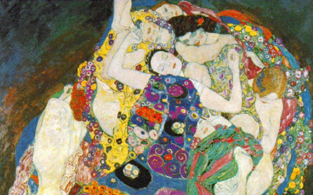
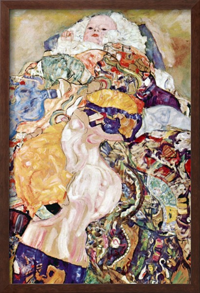
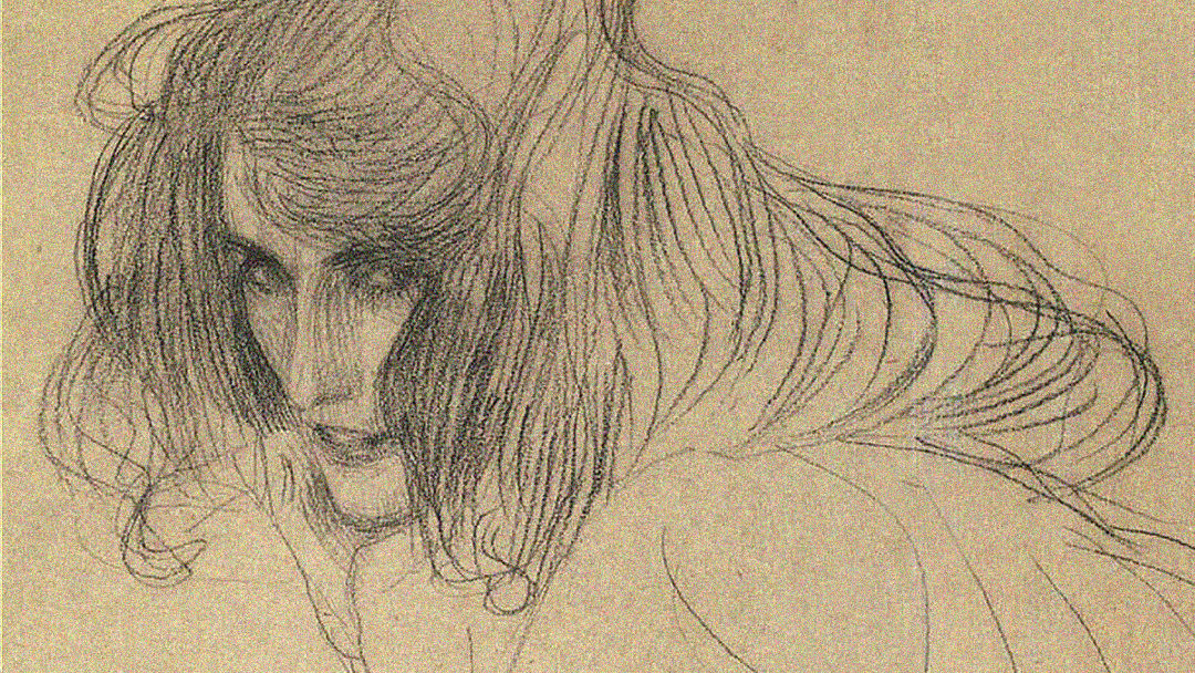
The artist who inspired me the most on my final project is Gustav Klimt. He was an Austrian Symbolist painter who lived from 1862 to 1918. In many of his paintings, he focuses on the female body as his subject, surrounded by many marks of different colors and textures. Inspired by Japanese art, his paintings have a stylistic use of lines, a very flat, two dimensional depiction of the subject and an attention to detail. I have always been inspired by his draftsmanship; his use of lines is sensual and loose yet very frank and direct. It makes his subjects look mysterious. I also admire his painting style, how he fills each and every corner of his painting with detail. As a Symbolist artist, the colorful marks he make in his paintings stand for something. In a way, Klimt’s art has influenced me to use symbolism in my project as well.
My three paintings depict a self portrait of myself, curled up in a blanket, sleeping. Sleep is a very important subject to me because of my love/hate relationship with it. I love to sleep when I am tired, and I am usually always tired because of sleep deprivation, but often times, I cannot fall asleep because I would think of all the things I could be doing in the hours I spend sleeping.
I am interested in the use of aromatherapy, how different flowers affect sleep. Having used Chinese aromatherapy a couple of times and I was surprised that it somewhat works. The different smells of different flowers calms you, makes you think of different things in your sleep. For example, the cherry plum allows the mind to surrender to slumber, the morning glory helps to adjust your sleeping schedule and the chestnut helps to make the sleeper feel safe and supported. Even though these descriptions are maybe too good to be true, I'm interested in how different smells shape dreams. Dreams can seem like real life, except for a few changes or bizarre occurrences, such as when the flowers start to flow out of your blanket.

The image that I am trying to portray is split into three parts, each on three different sized canvases. I wanted to use three different sized canvas because I wanted to play with the size of different spaces I could use to depict a part of a whole picture. The biggest canvas that I made is 3x5 ft, and it contains the head and an arm of the sleeping subject. The second canvas is 3x3 ft, which contains the drifting arm of the subject. The third and smallest canvas is 3x2 ft and it contains the feet peeking out from under the blankets. I picked three types of flowers to focus on, the first one being the cherry plum, the second being the morning glory and the third being the sweet chestnut. I wanted to show a surrealistic scene of myself sleeping, dreaming of the therapy I am undergoing in order to adjust my bad sleeping habits.


0xAABD43F9CD806AD2301E68C7E784D503.jpeg (1780×1800)

James Jean and Artist Statement

Recently I have been invested in James Jean’s work and his abstraction and freedom of creating his own environments in art.  In his work, there is a lot of fluidity of creating different planes and having them intersect whether they be figures or fluid stokes resembling a landscape. In my final, I aimed to be more relaxed in my stokes and trust experimentation with paint as well as allowing the viewer to understand my work rather than spelling it out for them.


In Jean’s pieces, he has detail to the point of abstraction. I find myself getting caught up in realism and the detail behind it, that I sometimes lose my creativity in painting. Comparing myself to Jean, I hope to create a focused color pallet with fluid stokes and still maintaining a solid idea and narrative behind it.  


With his work, there is an openness to interpretation from all viewpoints, which makes it all the more compelling. I personally tried to incorporate size and shape into my pieces just as much as the paint itself. Through this, I hope to take the viewer away into this mental world that they can decided the narrative and easily attach their own beliefs to.  

When it comes to Jean’s techniques, the smoothness of his pieces are impeccable. To incorporate that into my work, I tried to play with the balance of my pieces. By having 4 be skewed but equal in overall size, I was very conscious of having a balance of imagery. On my side panels, which were almost the most difficult part, I had to really know how to step back and not overdo anything. Especially the experimentation of them, I found myself at times trying to do more than I had to and catching myself in the act. Overall, this collection was a personal challenge but with this inspiration in the back of my mind, I was focused enough to try to change myself to better serve the vision.

ARTIST STATEMENT:

Over the years, I have come to realize that my art always has a narrative. Telling stories is my passion whether it is through acting, art, or something in-between. Having the opportunity to create my own stories and share experiences or feeling that can somehow be communicated universally is something I strive for.
With this collection, the focus of religion and how it seems to have been a universal feeling and belief for thousands of years was extremely important. The fact that millions are faithfully dedicated to a form of afterlife spanning over so many different religions is something magical. With that, I chose to explore the relationship between an unearthly “good place” and “bad place”. However, abstracting them, I wanted to highlight there are always hidden negatives and positives to every situation and setting.

Being inspired by the true definition of sublime, “the [beautiful] … does not invite such contemplation but instead is an overpowering or vast malignant object of great magnitude, one that could destroy the observer (Arthur Schopenhauer)”, I wanted to represent the other sides of Heaven and Hell that can cause confusion and doubt with previously conceived notions like many situations that are faced in everyday life driven to the extreme.

Saturday, December 10, 2016

Matthew Richie

I first heard about Mathew Richie last year from a friend of mine and although I admired his work I never really did extensive research until. As I was painting the final for this class, Lia had recommended me to look up Mathew Richie for inspiration. I instantly connected to his pieces because he was able to create so much depth and manipulate space in his work through his composition. 

Mathew Richie was born in London, England in 1964 but currently lives in New York. He received his BFA from Camberwell School of Art in London and later attended Boston University. Ritchie is such a diverse artist and is not just a painter but also creates works on paper, prints, light-box drawings, floor-to-wall installations, freestanding sculpture, websites, and short stories.

 His works mainly pertain to outer space, quantum mechanics and the vastness of the universe. In his works he tests the boundaries of representation through his abstracted lines. He first started his investigation of the cosmos in the 90’s and while his works started off as a 2-dimensional piece, they slowly evolved into 3-dimensional paintings. He began doing wall murals that would seem to carry on endlessly and incorporate sculpture with his paintings. The sculptural aspect of his installations mimics the line work of his paintings and allowed the painting to come off the wall. It invites you into his work and allows you to feel like the painting is almost coming out at you. His pieces are so powerful not only because of its size but also because he is able to express a concept that is not tangible. Quantum physics is a theory of things not visible to the eye and a concept that many people do not understand but Richie is able to bring it to life and interact with his viewers. Richie's goal is not to explain how light travels, or how wave particles work, but also to show his viewers what the world is. He wants to slow things down so people can see how the world would look if you could see wave particles, etc. In one of his interviews he says, "It is not about traditional modes of representation. For me, making art is a way to examine the limits of perception."


Saturday, December 3, 2016

Takashi Murakami

Murakami is known to blur the line between high and low arts because his work is considered kitschy and commercial yet his process and designs have roots in traditional Japanese fine arts. Also, the complexity and uniqueness of his work earns him the labels of “influential” and “genius”. His art could be found on shoes, luxury bags and clothes, yet at the same time people can see his paintings, installations and sculptures in museums.
The first time I saw Murakami’s work in person was at the Broad. Before this, I hadn't thought much of Murakami’s work. I have always been interested in Japanese anime and manga so his work has caught my eye several times, but eventually I thought that his work was very commercialized, uniform and popular just for the sake of being popular. When I saw his paintings in person however, I was in awe at the complexity, the physicality and the painstakingly perfect flatness of each patch of color, which reminded me of traditional Japanese printmaking because it looks very simplified, flat and graphic, yet the process requires a lot of skill and craftsmanship. Murakami has coined the term “superflat”, where forms are flattened in Japanese graphic art, animation and fine arts. The term became a movement that is very influential in Japan but it also reflected Japanese post war culture, which was considered “flat”. I found it interesting that Murakami also studied traditional Japanese painting, Nihonga, and got a PhD in it. His art not only reflects traditional Japanese art but also Japanese post-war culture, something that Murakami pioneered during the 1900s.
I now admire Murakami incorporating his own culture of art into contemporary work. Initially, his art may seem only colorful, cute, and graphic, but I've also come to admire the level of detail and skill he puts into making his art. What really amazed me about Murakami’s work was that each and every piece of his paintings was colorful, complex and immersive. For my final project for this class, I also want to create a similar colorful, complex and immersive world.


Wayne White

I’ve always been interested in text in paintings because of its simplicity but also complexity. It's about much more than just the meaning of the words, it is also about the image that accompanies it, the context and also the type of font that the words are presented in. Font intrigues me because it conveys so much with so little. This is why I had always been interested in Ed Ruscha’s text paintings. What drew me to his paintings are its graphicness, dry wit and minimalism. So, when I saw Wayne White’s work, which is also text based, I was a bit inspired.
White’s paintings are funny to me because they consist of large 3D text painted painstakingly into old-fashioned landscape paintings that he found in old antique shops. The text would be painted with perfect perspective and lighting so that it looks like it is actually part of the world of the original painting.  As we look at White’s paintings, we are transported into a different world, where words are built into the landscape. They would be ironic and vulgar phrases like “Art is supposed to hypnotize you or something”, “Turd”, “Fanfuckintastic” and much more. It was fun to go through all his paintings, to read all of the strange, inappropriate but utterly familiar phrases that we might use in daily life, written in grand, other-worldly font. The artist is presenting language, colloquialism, something intangible, invisible and sometimes underestimated, as something that is mountainous, otherworldly, and grandly important.
Being someone who is not very good at expressing my own thoughts through words without using visuals, Wayne White’s work is very refreshing and exciting to me. I would like to make more text based work in the future.


Hernan Bas

Hernan Bas was born in Miami, Florida and currently lives and works in Detroit. His work is characterized by vibrant colors, and expressionism. He is heavily influenced by the aestheticism and decadence periods which began in the late 1800s and focus on the combination of art and literature and the interaction between art and life. This period challenged victorian thinking through the exploration of a new relationship between sex, art, life and normal ideas of beauty. Bas' work is influenced by novels and essays from this period as well as his own internal experiences as an adolescent.

In much of his work, Bas depicts boys in abstract, dark and colorful landscapes with lonely expressions. His work began when he was an adolescent figuring out his identity. Bas is a gay artist but did not feel as though he fit the explicitly flamboyant gay stereotype nor the masculine jock stereotype and felt somewhere in the middle. He depicts his feelings of confusion and transience through his paintings. Bas portrays stories through his work and thinks of his series as chapters. This approach references Bas' influence from literature.

One thing that draws me into his work is the vast array of materials and methods he uses. He makes oil paintings, mixed media collages, prints, and pencil drawings, often using a combination of these different methods in one piece. Bas uses different surfaces as well such as cotton, canvas, paper and wood panels and as his work progresses his pieces are becoming larger.

The work of Hernan Bas has been very influential in the direction I am taking on my final series. His work is relevant in its form and content but also its message. He creates a vast amount of space in his landscapes and distorts reality and perception. The paintings have a dark and nearly sinister feeling but are balanced by his use of vibrant colors. His landscapes make the viewer feel as though they are in a distant and surreal place. The spaces appear as though they could be from a fantasy novel or story and convey sensual and homoerotic undertones.